Image: Tate Modern
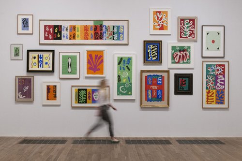
Although familiar enough in themselves, nothing prepares you for the real-life scale and impact of Matisse’s cut-outs (now on show at Tate Modern). The colour is not completely flat, nor are the edges as defined as we see in reproductions. The scissored contours, the laying of paint on paper, the pinning and pasting give these works a tactile quality when seen up close. The tangible presence makes them all the more powerful, reinforced by film sequences of Matisse cutting out shapes freely with big tailor’s scissors.
As he gave up painting in later life to concentrate on cut-outs and other forms, he started to take up commissions enthusiastically, operating (arguably) more as designer than artist. Sometimes, starting without a brief and later encountering client rejection, he seemed miffed but undaunted by these experiences. His commission to create windows, murals, artefacts and vestments for the chapel at Vence placed him in a role in which he seamlessly crossed media in an endeavour to build a cohesive response to the task, just as a designer might. Matisse’s influence on graphic design has been enormous and, despite the imitations that force us to conflate familiarity with contempt sometimes, he is still up there.
Last year I visited the Musee Matisse in the now worn-down former textile town of Le Cateau-Cambresis in northern France. The museum, quiet and mostly empty of visitors, brings home the contrast between the place he grew up in and the work he produced towards the end of his life. There’s something about his knowledge of textiles from childhood that makes a connection though – the scale of printed fabric, the repetition of motif and pattern, the tactility of material, and, of course, the saturation of colour.