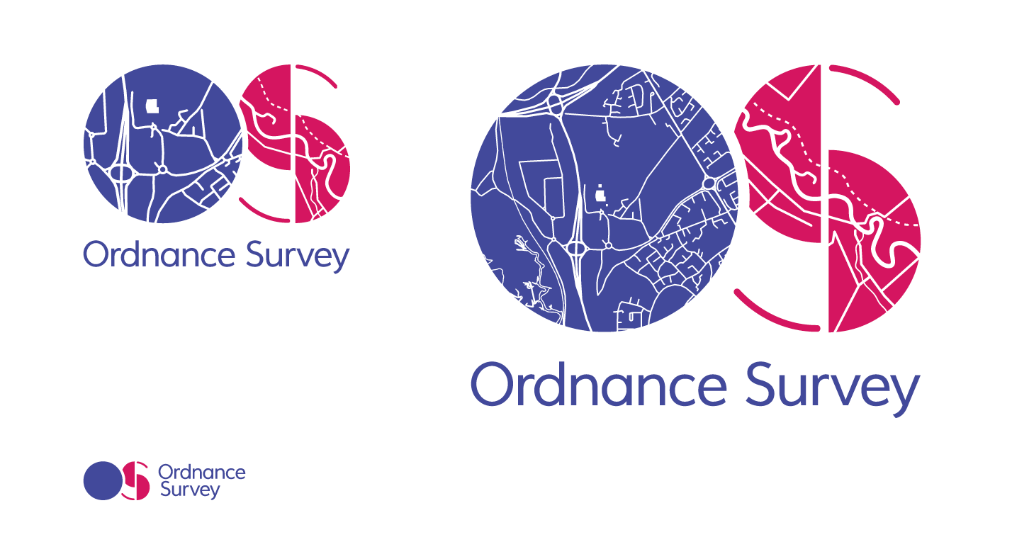
Some years back we (at Lloyd Northover) helped the Ordnance Survey update its identity as it started to move into the digital era. A year ago the organisation went through another change, as they do from time to time. The simple North-pointing arrow, the basic compass reading for orienting yourself, has been replaced by O and S letters that focus on a schematic map. Although the assertion is that the new identity works better in digital contexts, it seems unnecessarily fussy and appears in different versions for small sizes. It is also pictorial rather than symbolic, which seems to narrow its focus rather than broaden it.
The good news is that the organisation is developing technologies that impact on our lives in more ways than just finding our way across difficult terrain when out hiking. Smart cities, the internet of things and other buzzy issues of our time, as well as a variety of mobile apps, are in the sights of the mapping agency. It is even currently asking for symbol designs to depict landings on their map of Mars.
Despite these innovative moves I find myself drawn back to the iconography and typography of earlier OS maps. The simplicity of the symbols for a church with a spire or a tower is hard to beat, even though they now stand for ‘places of worship’, and both spires and minarets are depicted by the same icon – a cross over a solid circle.
As far as type is concerned both Times and Gill did good service in OS maps from the middle of the last century when the printed map was still the dominant medium. Before then type, like everything on the maps, was engraved by hand, including the iconographic symbols we still recognise. The relevance of reductive design, and the ability to read a route at small scale, is as important on today’s mobile device as it was back then. In whatever format the OS map is still the go-to map when walking off-road.